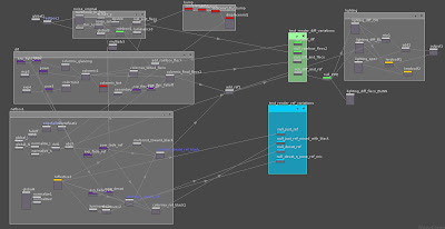
latest VOPnet:
this version is alot cleaner:
the red nodes arent being used - ie bump.
the green and blue netboxes are there so i can quickly test different combinations of the Vopnet - like just the reflection without the diffuse contributing for example - effctive just acting like a switch but a bit clearer to see whats going on from a glance - due to naming of nodes.
in this version i have different amounts off fallof for different elements - the reflection fades off differently to the the mix of colours and flecs contributing to the diffuse.
I used a power of .85 on the absolute dot product between the normal and viewing angle for mixing the diffuse colours - the blues.
.95 for mixing in the flecs
.75 for the reflection
.75 for the desaturation of the reflection
latest update:
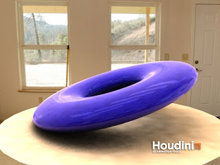
heres my latest efforts. ill keep everything in this post and add new images to the top.
now i have a HDRI image as bg.
this is also being used as a reflection
in additionto this - i also have some reflection cards - which arent in the pic - but you can see their reflection on my flattened torus -the white rectangles.
there is a GI light in the scene as well using the HDRI image to light the scene - this is the only light.
there is a disc to catch the shadow as well - this is shaded with a grey clay shader -- the colour (similar to the bg) is coming from the GI light and the image it uses.
the bg is visible due to a sphere with the HDRI (smaller jpg form) mapped to it.
id like to work on lots of aspects of this pic.
i feel the reflection isnt faded enough at the front of the torus - where the reflection should be minimal.
the HDRI isnt accurately reflecting on the torus - i may need to rotate the 'env sphere' around to match the bg with the reflection.
the paint flecs are too far apart and they dont seem to fade as surface rolls off to a perpendicular angle to the camera
the shadow is too grainy - more sample are needed in the GI shader
i can see the polys on the torus - more subDivisions needed for a smoother surface.
but for now i tihnk i will leave this for a while...and do some more HDRI testing and research.
after all - car paint shading is an exercise in realism - and HDRI lighting is good for realism.
maybe one more render :D
----------------------------------------------------------------------------------------------
every thing below here is older.
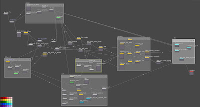
ok heres a break down so i can make a better one.
theres 5 main sections
- noise /flecs
- diffuse
- fall off
- lighting
- reflection
these should be optional for mid / far shots
diffuse
at the moment - this is very simple and doesn't have its own netbox
i only consists of 2 shades of blue mixed with some noise and mixed in with a darker
version by the falloff output
falloff
basically i have two colours mixed together by the falloff.
the fall off itself is made with two methods
- the dot product VOP
- the fresnel VOP. currently the switch is set to use the fresnel as the input
this falloff is used for several different things
- mixing the diffuse colours
- fading the reflection
- fading the saturation of the reflected light - probably at a different rate
- fading the saturation of the diffused light - probably at a different rate
lighting
i wasnt sure what to do here, so as an experiment - i have averaged
vex specular , phong, and anistropic lighting together ! :D why not - experimentation teaches !
but basically the light the viewer sees should be broken down to
- diffuse
- specular
- reflected
- bloomed
ive then simply added the reflection on after this
im not sure if this is right - or if it should be added before the lighting models - or if it even matters
in the reflection VOPS:
i have normalise VOPS for N and I going into a reflective VOP
if i connect the output to this reflective VOP - all i get is pure reflection
(NB the reflective vop doesnt need global variables put into it - it does this automatically)
this reflection is then mixed into a low-sat version of the diff map - just the blended
colours using the falloff as the mixer.
So how can i improve this ?
well for one there is some things just wrong here - why am i mixing in white ? i dont know...
:|
the network looks very spidery as well---which means its probably badly organised.
i could do some research...that comes next.
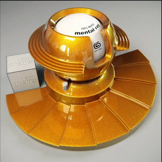
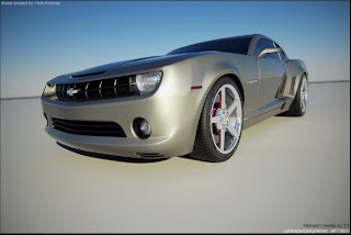
here's some reference, thank you Mr. Patton, great work !
Jeff Pattons Mental Ray Research


No comments:
Post a Comment